Analyze the COVID-19 pandemic
Introduction
Throughout COVID-19 pandemic, the Data Commons team worked to upload COVID-19 data as it became available, helping public and private sector analysts create evidence-based policy to combat the public health crisis. This tutorial presents an example of how to obtain use Google Sheets to obtain the data from Data Commons and create visualizations for it.
Step 1: Setup
Pull up Google Sheets and create a new, blank spreadsheet. You can title it Data Commons COVID-19 analysis or any other name of your choosing.
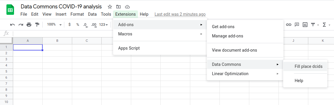
To enable the Data Commons API in your spreadsheet, ensure that the Data Commons extension is installed and available under the Extensions menu. Hover over the Data Commons menu item, then click on the Fill place DCIDs option.
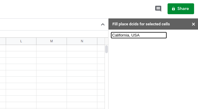
A menu should pop up on the right side of the Sheets web application. Type the name of any place desired; its DCID should populate into the A1 entry of the chart. This step is required to enable the Data Commons API.
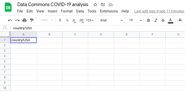
Next, double-click on A1 in the chart and type country/USA.
Step 2: Retrieve place names and DCIDs
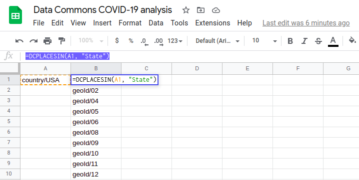
To obtain the DCIDs for all the states, you can use the plugin function DCPLACESIN. In cell B1, type =DCPLACESIN(A1, "State"). Sheets provides pointers to help guide your function inputs. Your spreadsheet output should look like this:
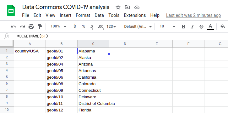
Finally, you’ll want to retrieve the state names and position them conveniently near these DCIDs. You can use the add-on function DCGETNAME to access this information. In cell C1, type =DCGETNAME(B1:B). Your final output should look like this:
Step 3: Populate the spreadsheet with COVID information
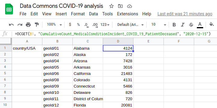
Let’s analyze each state’s cumulative count of deaths due to COVID as of December 31, 2022. To do this, we get the value of the statistical variable CumulativeCount_MedicalConditionIncident_COVID_19_PatientDeceased for each state on the date specified. You can use the DCGET method to do this.
In cell D1, type =DCGET(B1:B, "CumulativeCount_MedicalConditionIncident_COVID_19_PatientDeceased", "2022-12-31"). Your final output should look like this:
Step 4: Visualize the data
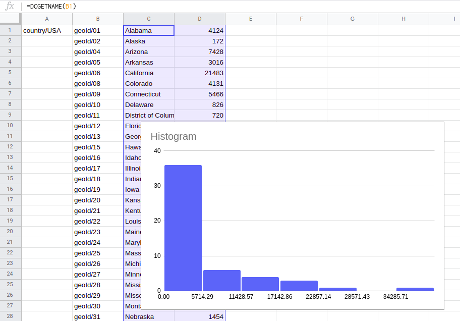
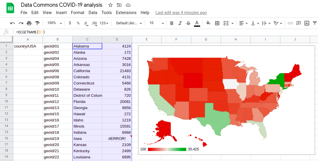
As a final step, you can use Google Sheets’ Chart option to map this data! Select cells C1 to D52, then select Insert > Chart. Your spreadsheet will look like this:
Feel free to drag the histogram out of the way of the numbers! As a final step, in the right sidebar Chart editor, from the Setup > Chart type drop-down menu, select Map. Then, from the Customize > Geo > Region drop-down menu, select the United States. Your final sheet should look something like this:
Page last updated: July 06, 2026 • Send feedback about this page